Try to focus on the color tone. Various colors and patterns can be used, but the overall tone must be balanced. You also need to have different textures; silk pillows are not that interesting until you throw in a cashmere or velvet to the mix.
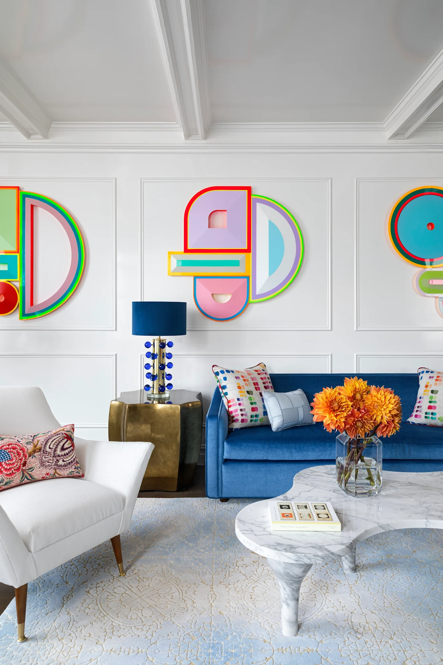
Art-Loving Living Space

Kim Scodro
Interior Designer
Known for her timeless yet modern sensibility, Kim Scodro, principal of her namesake interior design firm, blends elegant materials, rich textures, and layered details to create inviting and sophisticated interiors for her clients.
Known for her timeless yet modern sensibility, Kim Scodro, principal of her namesake inter...
While typically we do not like to “match” art to a room, we do need to consider the backdrop. The artwork here, for example, is quite impactful, so using a bold paint color or wallcovering would not make sense. Most art galleries have white walls so the artwork can shine; this is also true in a space.
We almost always mix. It creates depth and adds a subtle layer of warmth to a space. The key is to be thoughtful—balance cooler tones with warmer ones.
Stick to a single color family, but play with texture and tone with different materials. Start with something rich, like a bold blue velvet, then bring in softer shades through cotton, silk, or cashmere. Mixing in hard surfaces—like stone or wood—helps balance everything out so the space feels intentional, not overwhelming.
It’s important to see paint samples in different areas of the home to see how the light hits. The same paint can look completely different in daylight compared to evening. Seeing the variation in paint color throughout the day and in each room is essential before committing.
I love Benjamin Moore’s White Dove; it’s not too gray and not too yellow — it’s pretty perfect.
We recently installed a copper bar in a beautiful oceanfront home — a departure from how we’ve used copper in the past. Typically, we bring in antique teapots or bowls to add a warm, timeworn touch. But in this space, the clean-lined design gave the copper a sleek, modern edge. It was a dramatic shift, and a good reminder that mixing metals always adds an unexpected layer of interest.
Interview by Kerstin Czarra