
There’s something soft and serene about neutral color palettes that makes them appealing in interior design. Sure, bold colors can be splashy and energetic. But if you’re looking for rooms that are relaxing and easy to live in, year after year, you can’t go wrong with neutral color combinations that whisper instead of shout in design schemes.
Not only do modern neutral paint colors, finishes, and materials provide a somewhat universal backdrop for all different kinds of decor, art, and objects, but these shades also can provide visual benefits that louder hues can’t. For example, lighter neutrals can make a space seem larger with their light-reflecting qualities, while any neutral, no matter its saturation or darkness, is simple enough to let the handhewn textures in a room shine. Since many neutral shades are also present in nature — from tawny sands to earthy greens and beyond — they’re also very grounding. Neutrals also tend to play well with just about any accent colors, which is great news if you do want to pepper in a few zingier furnishings or details one day.
For all of these reasons and more, 2026 interior color trends are favoring neutrals. Many options exist when it comes to neutral color palettes, though. So you’ll want to read on to see which neutral palette might speak to you — and how designers hone in on their favorite neutrals to create flow and cohesion across a whole home.
Why Neutral Color Palettes Are Evolving
Once seen as boring or one-note, neutral color palettes have risen in popularity over the past few years, especially as the definition of a neutral has shifted. “Neutral” used to refer specifically to shades of white, cream, gray, tan, and black. But now? The definition has expanded to include earthy and serene shades in a variety of color families (think: olive, navy, terracotta, and even some lighter hues like blush). The key is that these shades perform like neutrals in rooms, meaning they are visually quiet and can be combined with just about any hues successfully.
What Makes a Neutral Palette Renovation-Ready
You’ll know a neutral palette will work for a whole house when it feels timeless — not too trendy — and flexible enough to evolve alongside you as your design aesthetic may shift. The best neutral color palettes feel cozy, comforting, and consistent in undertone. Warm colors tend to look best with other warm colors, and cooler with cool, at least when it comes to the major foundational hues in a space.
8 Neutral Color Palette Trends Defining 2026
Looking for a renovation-ready neutral palette? These eight ideas can help guide you to total color bliss. Keep in mind, though, that none of these options are particularly bold. You can always add pops of color later. Right now, it’s all about establishing a broad foundation that’s grounding and steadfast — just like nature, where many neutrals have their source.
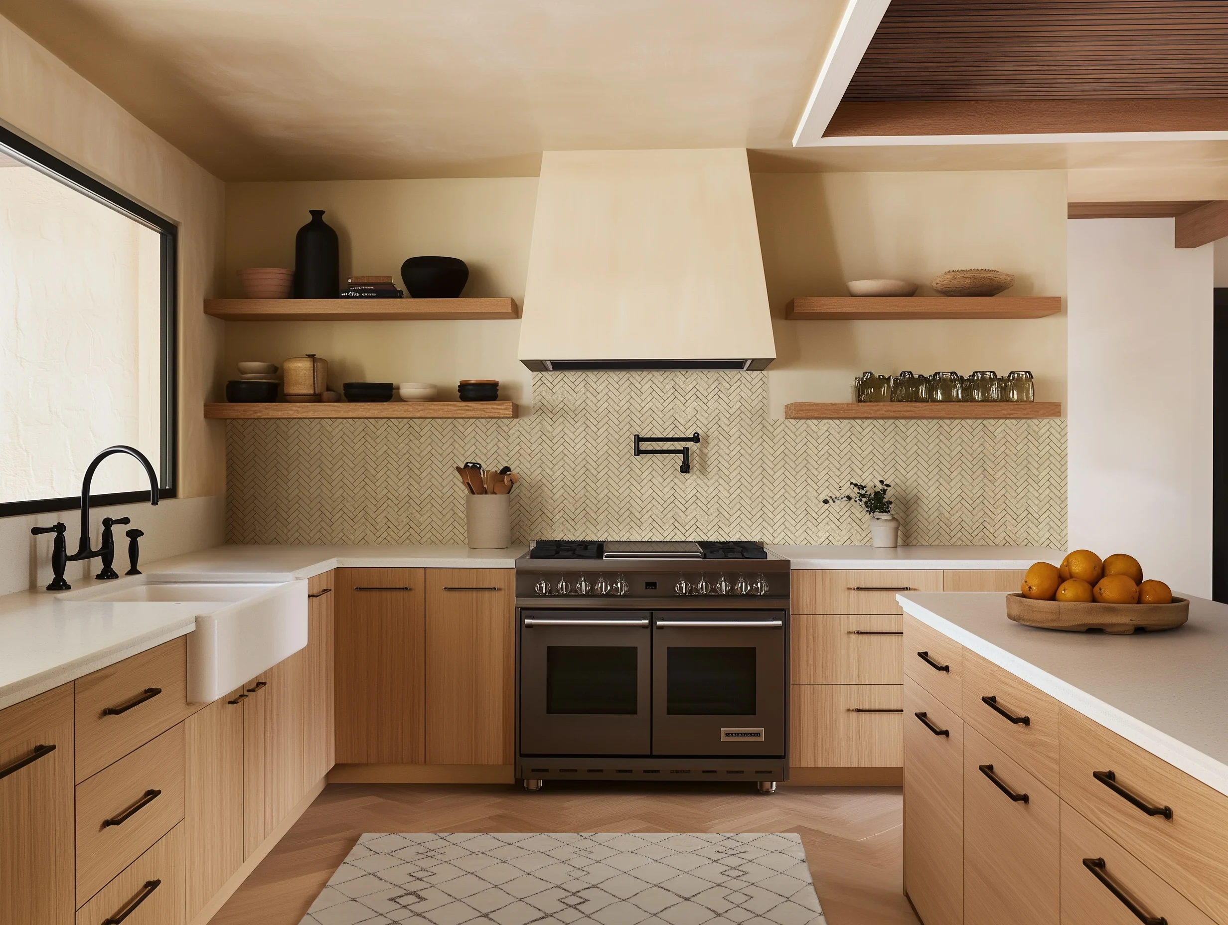
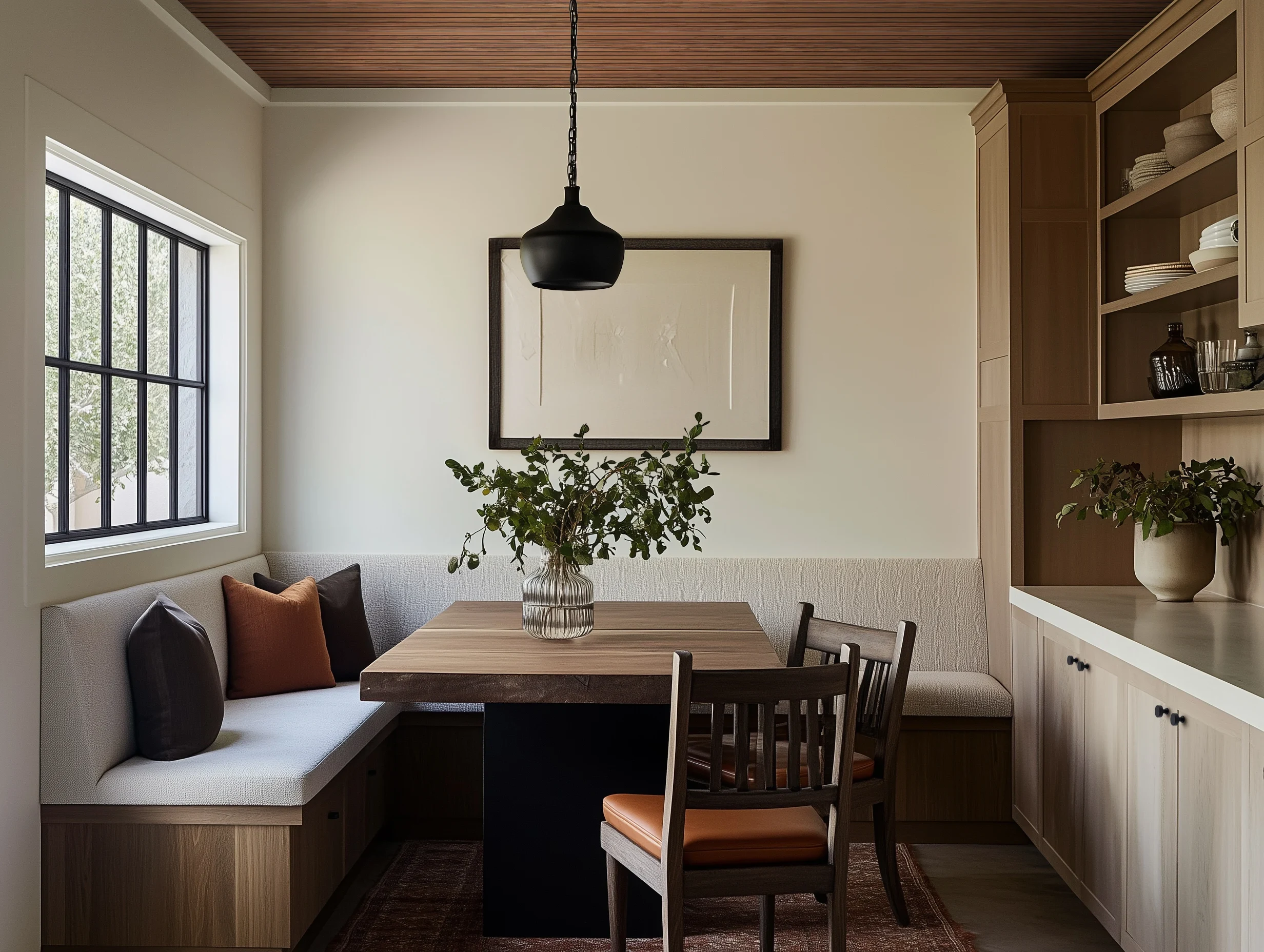
1. Soft Warm Beiges With Subtle Undertones
Beige is back, and it’s become a staple in kitchens and bedrooms for its sophistication and warmth. As an anchor color, a soft warm beige is both soothing and very livable, making it a great substitute for traditional white when you want a bit more pigment than an off-white or cream can offer. The great thing about beige though? Even though it’s a sandy shade, thanks to the bit of brown in it, it still has the crispness of a white and can play well with white trim if you like a more traditional look.
Beige works really well with other earth tones, probably because this color is seen so much in nature, from tree bark to beaches. It's also a shade readily available in natural stone, composite, and engineered surfaces. This means you can pursue a monochromatic room, or you can shake things up by teaming it with shades like terracotta, sage green, or even darker reds, like cranberry or wine.
2. Elevated Greige With Depth and Dimension
A shade somewhere between beige and gray, greige is a total color chameleon and a great hue to build a whole room palette off of, considering how visually quiet it is. This is true whether you pick a light greige that’s closer to taupe — or a deeply saturated version that’s similar to khaki or charcoal in intensity.
Because greige is a combo of gray and beige, it can work in warm or cool color schemes, depending on the version you choose. Consider what you might to pair it with when you’re making furniture and finish selections. Warmer greiges will shine when used with rich woods and brass lighting, while a cooler greige might be more at home with glass or silver accents. You can go high contrast by teaming it up with a bright blue, or you can lean into its earthiness by pairing it with a color like moss green.
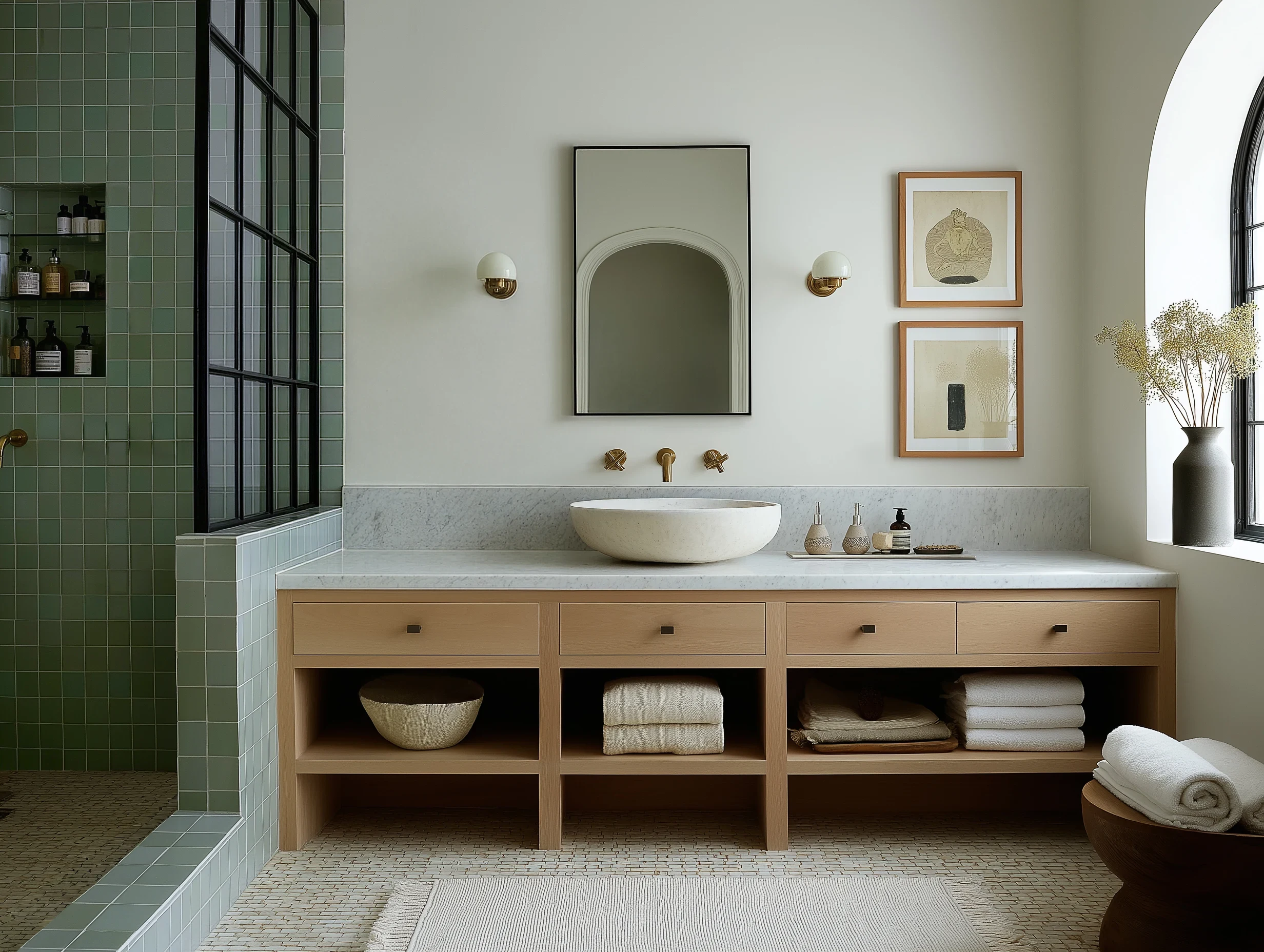
3. Creamy Off-Whites That Are Not Stark
The clean, all-white-everything look had its moment in the late 2010s, thanks to the popularity of minimalist white sofas and walls — plus, the major resurgence of subway tile in spaces like kitchens and bathrooms. But for 2026, whites have gone warmer and softer, with creamy shades of off-white making rooms more liveable and cozier on the whole.
Off-white walls can work just like true white ones, making them a perfect backdrop for art and accessories in just about any accent shade or colors. For surfaces, look for a travertine, marble, or quartz in parchment-like tones that will harmonize with the off-white walls, while white oak can contribute to the tonal look underfoot. The overall feeling will be serene, snug, and restful — and anything but sterile.
4. Muted Taupes for Modern, Livable Spaces
When you want to make more of a statement than light-and-airy beige, taupe could be the answer. A refined grayish-brown, taupe has all the warmth of beige but more intensity. This makes it a great choice for someone who wants a neutral color palette but would like the vibe of a room to be moodier and darker on the whole.
Taupe tends to take on the feel of what you pair it with. So you could go super playful by teaming it up with a lavender or seafoam green. Or you can preserve this shade’s natural tranquility by using it with tan and champagne finishes. Make it look extra luxe by mixing it with jewel tones.
5. Stone-Inspired Neutrals Rooted in Natural Materials
Speaking of precious materials, you can build several neutral color palettes off of favorite natural stones. If you like a rustic, sun-drenched look, a creamy tan travertine could inspire your whole kitchen palette, and its colors will jibe well with limestone finishes or plaster-look paint. A favorite soapstone might be translated into a smokey gray bathroom palette that you could balance out with brushed brass fixtures. Slate skews a little bit more blue-gray and especially grounded when used with reclaimed woods.
Find a favorite stone sample, and pull a color — or colors — out of it. This design move will help you create a harmonious palette that can guide every decision you’ll make furnishing your room. If a group of neutrals work in nature, you can feel confident about them working together in your home.
6. Earthy Neutrals With Clay and Sand Influences
Clay definitely gives off a Southwestern vibe; after all, it was historically used as adobe for buildings and homes in that region for years. But this rusty-redish, earthy shade can also be a very beautiful way to go neutral and still embrace the richness of a heavily pigmented hue.
Even better, clay is one of the easiest colors to find a match for; you don’t have to look any further than a sandy tan for the foundation of a soothing color palette that still has a point of view. These colors feel warm, grounding, and universal, making them perfect for a living room or bedroom.
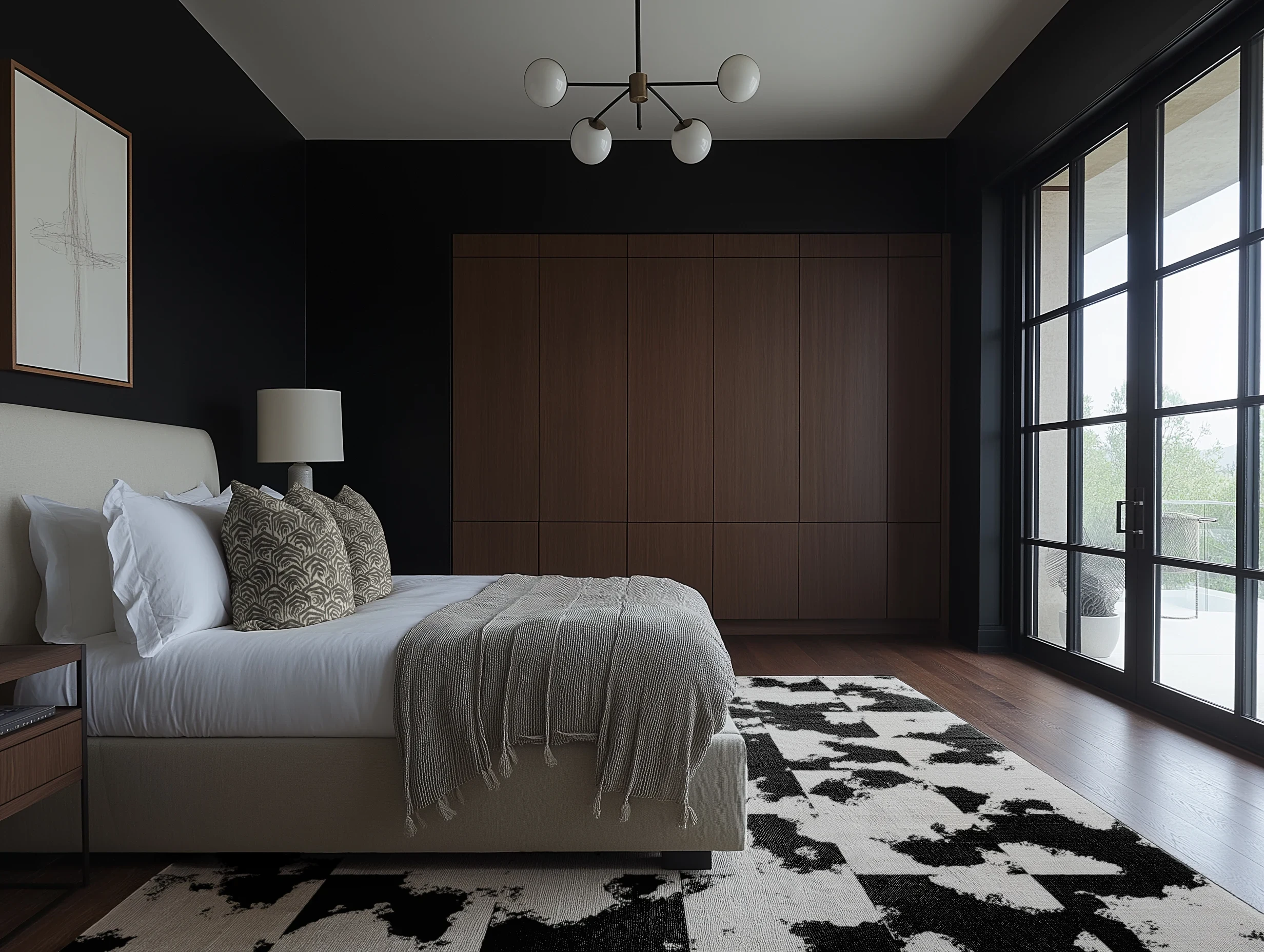
7. Cool Neutrals Balanced With Warm Finishes
Ash, slate, pearl, charcoal, eucalyptus — these cool neutrals have an innate serenity about them. That’s because they recede into spaces rather than calling attention to themselves, making them feel soft and enveloping. They’re easy on the eyes, literally, and the darker shades among them can create a cocoon-like effect when color drenching, or painting the walls, ceiling, and trim all the same hue.
If you choose to base a palette off of these shades, your walls and furniture will likely skew cool in undertone. To keep the scheme from feeling too chilly, you can warm things up with aged woods, living brasses, creamy warm whites, and touches of texture.
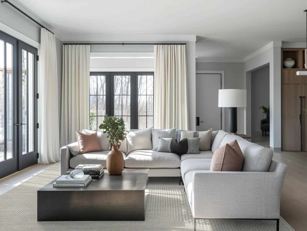
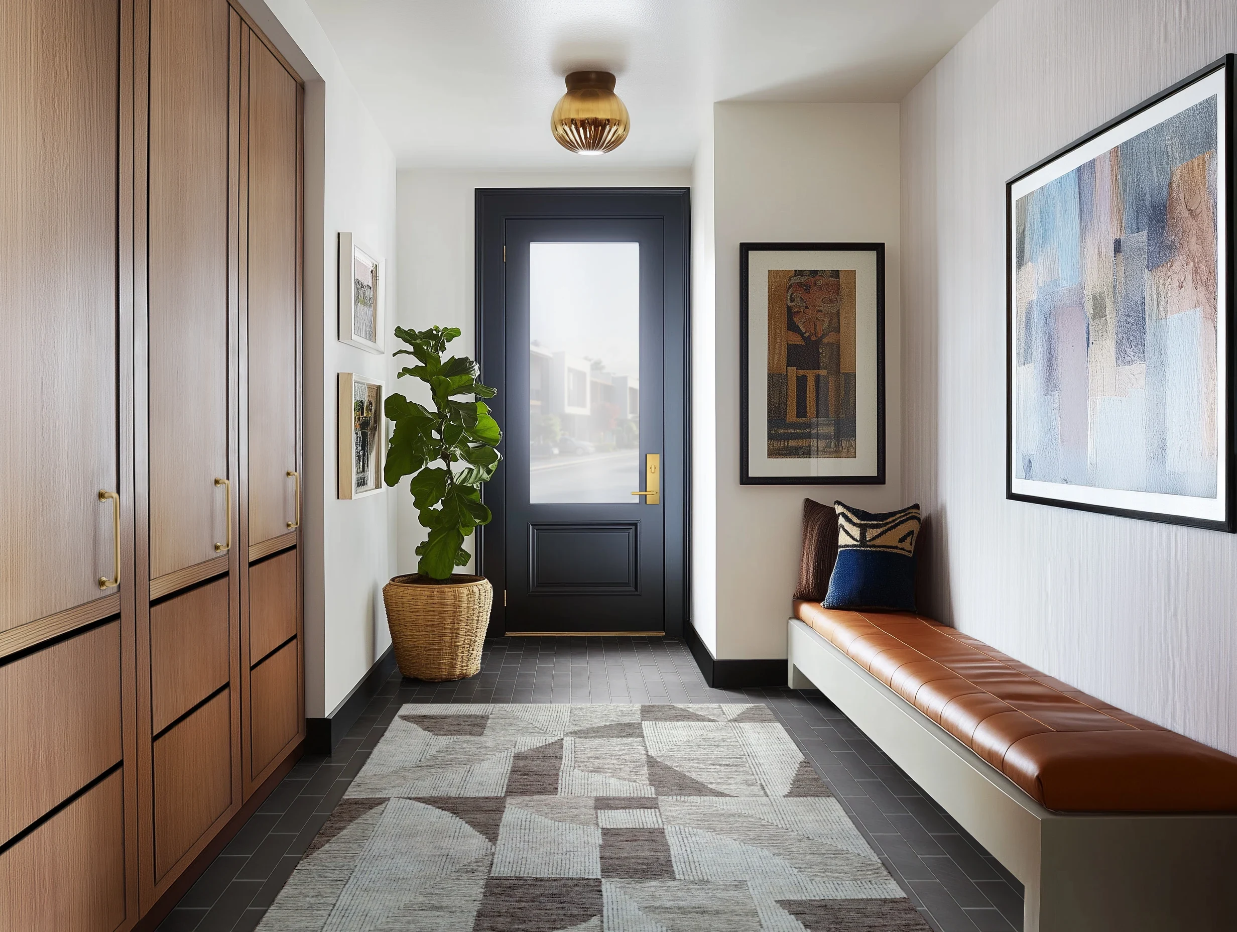
8. Layered Neutral Palettes Designed for Whole-Home Flow
Instead of choosing just one main neutral to base your palette off of, you can actually introduce a family of neutrals across your whole home to create cohesion and flow from space to space. This is a very intentional way to make your room’s transitions feel seamless so nothing appears jarring to the eye.
The key here is to lean into repetition. That doesn’t mean you have to use a shade in exactly the same way from room to room, though. As an example, a foundational hue in your living room, say your dove gray sofa, could pop up as the wall color in your bedroom. Maybe the hallway connecting the two is a soft, easy taupe, and the kitchen is beige-forward with a few dove gray accents. You still want to maintain some level of variety in the way you mix shades in each area; that way, the effect is curated versus predictable and matchy-matchy.
How Designers Use Neutral Color Palettes Across Rooms
When designers work with neutral color palettes across a whole home, rooms don’t necessarily match. Instead, the idea is that they harmonize with one another, connecting to each other visually without feeling exactly the same. The repetition of colors creates flow alongside layering; depth is achieved by introducing variations with texture and finish versus moments of high contrast.
When using a neutral color palette across rooms, designers also tend to stick with shades that have similar undertones. This also creates visual continuity and calmness, particularly in open plans where you can see one or more rooms from a single vantage point.
Warm vs. Cool Neutrals and When to Use Each
When you hear the term “warm” or “cool” coupled with neutrals, that refers to the undertone, or subtle hue that underlies a given shade. For example, olive greens tend to have warm yellow undertones, while eucalyptus greens have a cool, blueish-gray cast. Even whites, grays, and tans can lean warm or cool, depending on their undertones. Cool whites appear bluish, while warmer ones can have slightly yellow or pink pigments in them. Generally, the cooler undertones you’ll find are blue, gray, purple and green, while warm undertones include yellow, red, peach, and brown.
There’s no right or wrong answer when it comes to using warm versus cool neutrals. It all comes down to personal preference and how you want a space to feel. Warmer neutrals will make a space seem cozy and intimate, while cooler neutrals read as crisp and calm. The biggest thing to keep in mind is that consistency in undertones will make neutral color palettes feel more harmonious across a whole home. If you mix too many warm and cool shades in a single room, it may seem “off” and like it’s clashing a bit.
Shop Neutral Material Samples to Finalize Your Palette With Confidence
If you’re now sold on neutral color combinations for your whole house renovation or next room redo, you’re in the right place. DesignShop stocks paint, tile, stone, and flooring samples in a wide variety of soothing neutrals.
Ordering samples allows you to see these materials up close and in your own home, so you can be sure that you like the way they look in person. Neutral colors still have nuances, so it’s worth taking the time to do this. You’ll never regret this step because it can give you total color confidence, even when you feel like a color is “safe.”